GOTLANDS KOLLEKTIVTRAFIK
Gotlands Kollektivtrafik is the main public transport provider on Gotland, Sweden's biggest island and very popular with tourists. Despite its importance, the transit app received frequent negative feedback, with both locals and tourists reporting issues around usability, reliability, and general frustration. This project aimed to redesign the app experience based on user-centered research, ultimately improving how people navigate and rely on the island’s public transport system.
CLIENT
Gotlands Kollektivtrafik
YEAR
2024
CATEGORY
UX/UI Design
Fixing the Commute: A Smarter Transit App for Gotland
GOALS & SCOPE
The goal was to identify and address key usability issues in the Gotlands Kollektivtrafik app and deliver design improvements based on user needs. We focused on both locals and tourists, whose transit habits and expectations differ significantly. The project was led by me and a colleague, and together we drove the entire process, from research to final designs. The scope covered the full UX cycle, including problem discovery, user testing, competitor analysis, and interface redesign.
THE PROCESS
We began by analyzing user reviews from the App Store and Google Play, categorizing feedback to pinpoint recurring issues like confusing navigation, missing features, and technical bugs.
This was followed by internal and user testing, where participants completed common tasks like searching for routes or finding live updates. Key insights included:
Users often confused bus numbers with waiting times
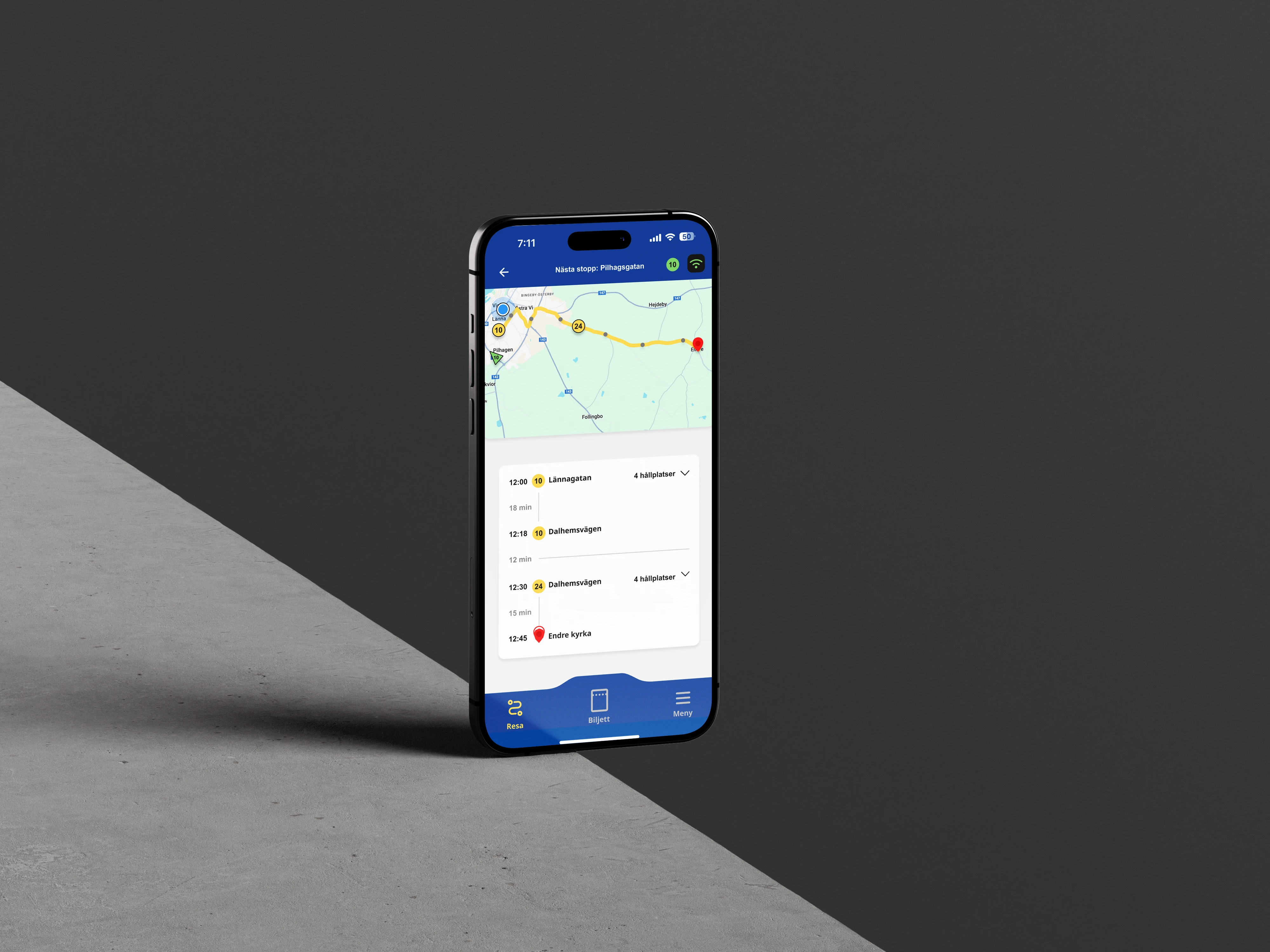
Live map features were largely undiscovered
Users wanted delay information, the ability to save routes, and easier ticket access
A competitor analysis revealed that the app lagged behind others in terms of both features and user experience.
We defined two primary user groups, locals and tourists. Then we mapped their distinct user journeys. This helped us identify pain points and tailor features to their specific needs.
Using these insights, we created user stories and tasks, managed in a Scrum board, and progressed through iterative design phases.
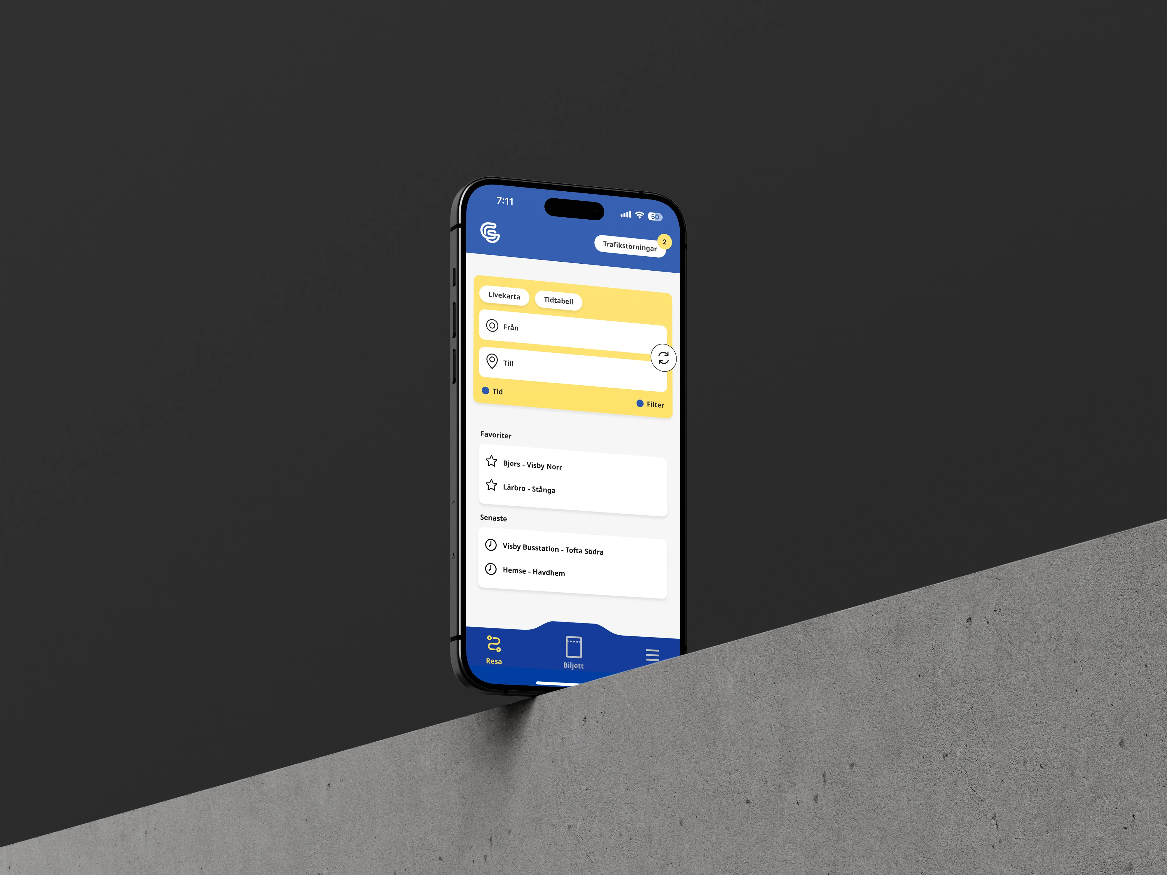
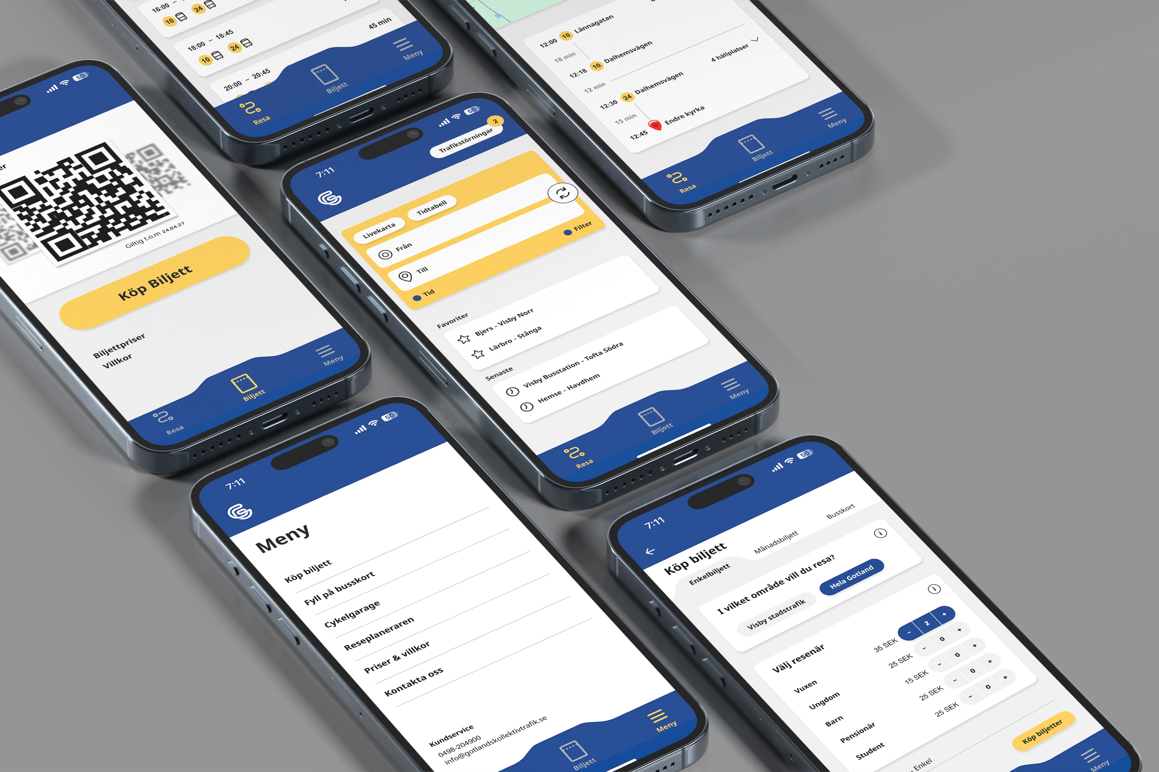
A new style guide was developed to refine the existing brand while improving accessibility and modernizing the UI. This led to the creation of wireframes and high-fidelity mockups for a redesigned app experience.
RESULTS & IMPACT
The updated app included several impactful changes:
Accessible timetable for quicker trip planning
Updated live map with clearer visuals and real-time tracking
Redesigned ticket system with visible prices, simpler purchasing, and in-app ticket storage
Favorite routes and search history to speed up frequent journeys
Improved navigation and streamlined interface for better usability
The new design significantly increased the app’s usability and better aligned it with both local commuters’ needs and tourist expectations, delivering a more seamless and reliable transit experience.
LEARNING AND INSIGHTS
This project reinforced the value of listening closely to user feedback and validating it through real-world testing. We saw how subtle design choices, like labeling, map visibility, and feature discoverability, can greatly affect usability. Differentiating between user types (locals vs. tourists) proved critical in shaping features that feel relevant and intuitive to each group. Ultimately, building around real user behavior led to a stronger product and a clearer design direction.

(4)